Stop rebuilding the same UI from scratch. Junno UI gives you production-ready dashboard templates and components built on shadcn/ui — for React, Next.js, Vue, Nuxt, and Tailwind CSS.
We built Junno UI for one reason: SaaS builders and dashboard developers deserve beautiful, production-ready UI out of the box — without spending weeks reinventing the same components.
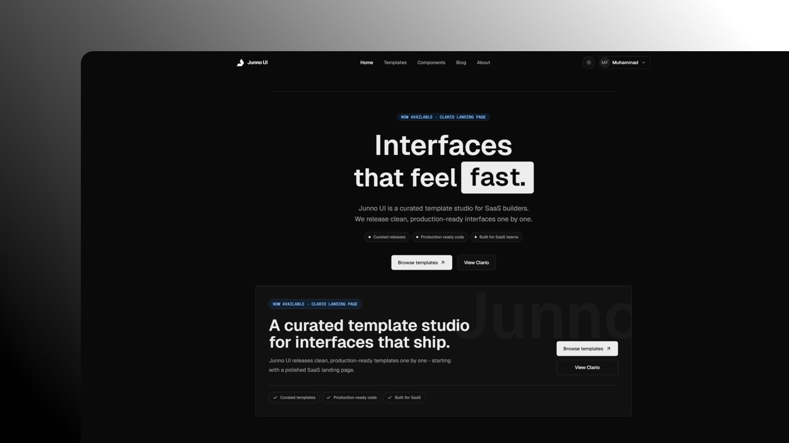
Junno UI is a premium UI kit and template collection built on top of shadcn/ui — the component system developers already love. We extend it with professionally designed templates and dashboard components, so you get the flexibility of shadcn/ui with the polish of a premium product.
Built for React, Next.js, Vue, Nuxt, and Tailwind CSS. Every template and component is designed with real SaaS products in mind — not toy demos.
Most component libraries are black boxes — you install them, depend on them, and every major update breaks something. shadcn/ui flips that model entirely.
You copy the code into your project. You own it. No version lock-in, no hidden abstractions, no surprises.
Junno UI builds on that philosophy. Instead of wrapping shadcn/ui inside another library, we give you beautifully pre-composed templates and patterns — built directly on shadcn/ui primitives — that you own just as completely.
Each template is a fully working starting point — responsive, dark and light mode ready, built entirely on shadcn/ui components with Tailwind CSS. Pick one, drop it in, and start customizing.
Analytics Dashboard — visualize metrics with charts, stat cards, and data tables
Admin Panel — manage users, roles, and settings with a clean, structured layout
CRM Dashboard — track leads, deals, and customer activity in one place
E-commerce Dashboard — orders, revenue, and product management made simple
SaaS Starter — sidebar, auth pages, and onboarding flow out of the box
Every template is assembled from shadcn/ui primitives extended with Junno UI's design layer — modular, accessible, and fully customizable. The code lives in your project, not inside a dependency.
All shadcn/ui primitives — Button, Input, Dialog, Dropdown, Table, Select, Tabs, Toast
Extended dashboard components — stat cards, sidebar nav, data grids, area & donut charts
Dark & light mode — every component supports both, out of the box
TypeScript — full type safety across every component
Accessible — WCAG 2.1 AA compliant markup by default
Tailwind CSS v4 — utility-first, fully customizable styling
Two steps to get up and running:
# 1. Init shadcn/ui
npx shadcn@latest init

# 2. Install Junno UI
npm install @junno/ui

# 3. Add components
npx shadcn@latest add button card table
Full documentation at junnoui.com/docs.
Stop rebuilding the same UI from scratch on every project.
With Junno UI on top of shadcn/ui, you get a solid, ownable design foundation that looks professional from day one. Spend your time building your product — not your component library.
Get started at junnoui.com or find us on Instagram @junnoui.
— Juna & the Junno UI team